Pulling together a successful interior can be tricky at the best of times, with so many different variables to take into account!
Here’s a rundown of the top 5 mistakes we see regularly… Make note so you don’t fall into the same trap!
-
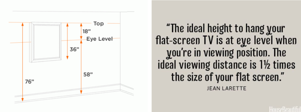
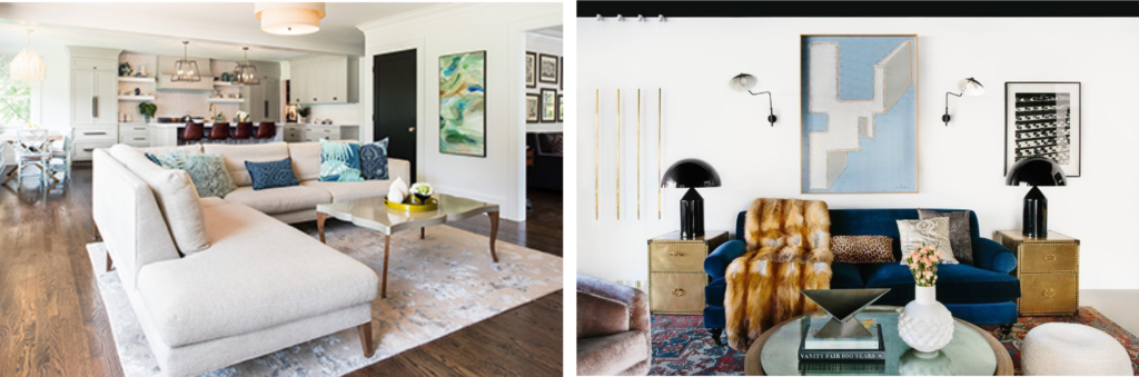
Art / TV too high on the wall
As a rule of thumb, art should generally be hung on the wall at eye level when standing. Placing pictures too high or low around this sweet spot instantly makes a room look off-balance as it alters our perspective of the ceiling height… and therefore all other proportions!
In contrast, televisions should be hung lower, to accommodate for viewing whilst seated. Too often TV’s are hung too high / mounted to standing viewing height, leaving you craning your neck up from the couch. Ouch!
(Images from Pinterest)
-
Furniture the wrong scale / proportion for the room
Yes, a bed so big you can sleep on one side and not hear your partner snoring has definite appeal, and yes, that big smooshy sofa is suuuuuper comfortable, but when you have to shuffle around it to get into the room, it’s probably that bit too big.
Heavy furniture in too-large a scale for the space is one of the most common issues we come across. Ideally for a room to balance and flow well, you should allow for at least a metre to walk around key items (sofas, dining tables etc.).
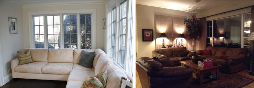
The couch in the first room is too bulky for the space – by filling the corner, the light and airy room feels stuffy The second room is overwhelmed with heavy, boxy furniture
(Image from Google)
-
Rugs the wrong size or orientation
A too-small rug can make a space feel closed-in and/or throw everything off balance, so always go slightly bigger and if need be place the front legs of your sofas on the rug to make the space feel larger.
Facing your rug in the right direction is another common mistake. In a lounge, the longest edge should run parallel with your sofa or the longest wall / in the case of a chaise or corner sofa; parallel with the longest side.
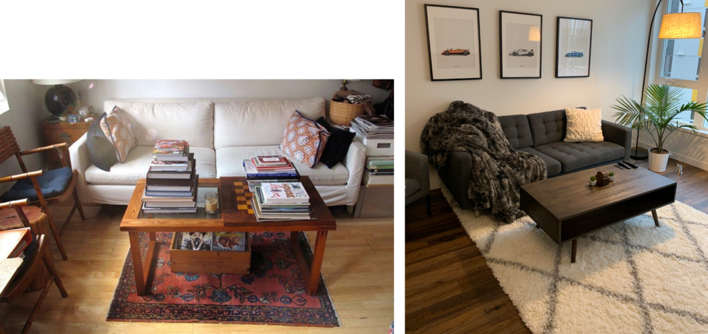
Rug too small… and the wrong way round…
(Images from Google)
-
Not enough lighting
Light is so important when designing a room. Think of it as a paintbrush with space-enhancing paint on it! General overhead lighting makes a space feel bigger, task lighting in the right places sets a mood and makes reading in bed, or finding the TV remote easier, while feature lighting makes a statement and grounds a space; anchoring whatever is underneath it as the focal point and highlighting it as “the place to be”.
A dark room feels cold and uninviting. Add some warmth and softness with additional light sources and if your ceiling only has space for one light, make it one that can point in multiple directions for maximum spread. Mirrors are also a great tool for helping to bounce light around a room.
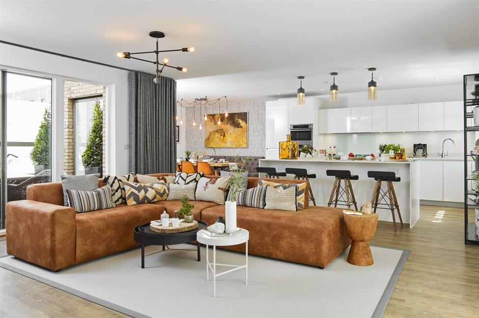
Multiple light sources help to highlight the different areas in this open plan layout
(Image from Google)
-
Following trends
We fully believe in following our heart when it comes to designing a space. Trends will come and go, but if you really love something , it will always ‘work’. When you buy to a particular seasons trend… and then said trend goes ‘out’ to make way for a new, completely juxtaposing one, rooms can end up feeling disjointed.
Buy once. Buy right. And before you hand over your credit card, really consider how much you love that item- make your design choices based on your personal aesthetic and you’ll create a space to love for years to come.
A low profile mid-century couch, classical-style coffee table, farmhouse dining chairs, industrial AND modern lighting, make for a confused space… “eclectic” can be a tricky style to get right.
(Images from Google)