
WARM LIGHT VS COOL LIGHT: HOW IT AFFECTS THE COLOUR ON YOUR WALLS
When it comes to creating a beautiful interior, paint colour is often the first thing people think about. But here’s the truth, most homeowners don’t realise lighting has just as much, if not more, impact on how a colour looks than the paint itself.
A perfectly chosen neutral can appear muddy, flat, or grey under the wrong lighting. On the other hand, thoughtful, warm lighting can make even the simplest wall colour feel rich, soft, and luxurious.
In this guide, we break down the difference between warm and cool light, how each one affects your wall colours, and how to choose the right lighting to complement your interior style.
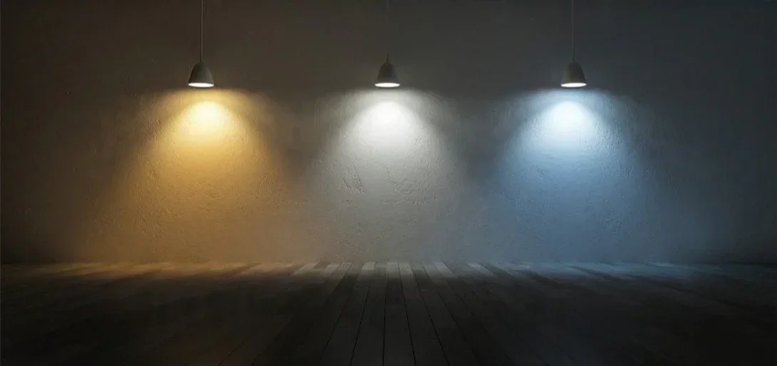
Understanding the Kelvin Scale (The Secret Behind Good Lighting)
Before we talk colour, it’s important to understand the Kelvin scale, the measurement used to describe the warmth or coolness of a light source.
2700K–3000K = Warm Light
Think soft, inviting, golden glows. This is what creates that cosy, high-end atmosphere you see in well-designed homes and boutique hotels.3500K–4100K = Neutral Light
Cleaner, brighter, and slightly whiter. Often used in workspaces or kitchens.5000K+ = Cool Light
Blue-toned, bright, and stark, similar to daylight on a cloudy afternoon. Typically found in offices or commercial settings.
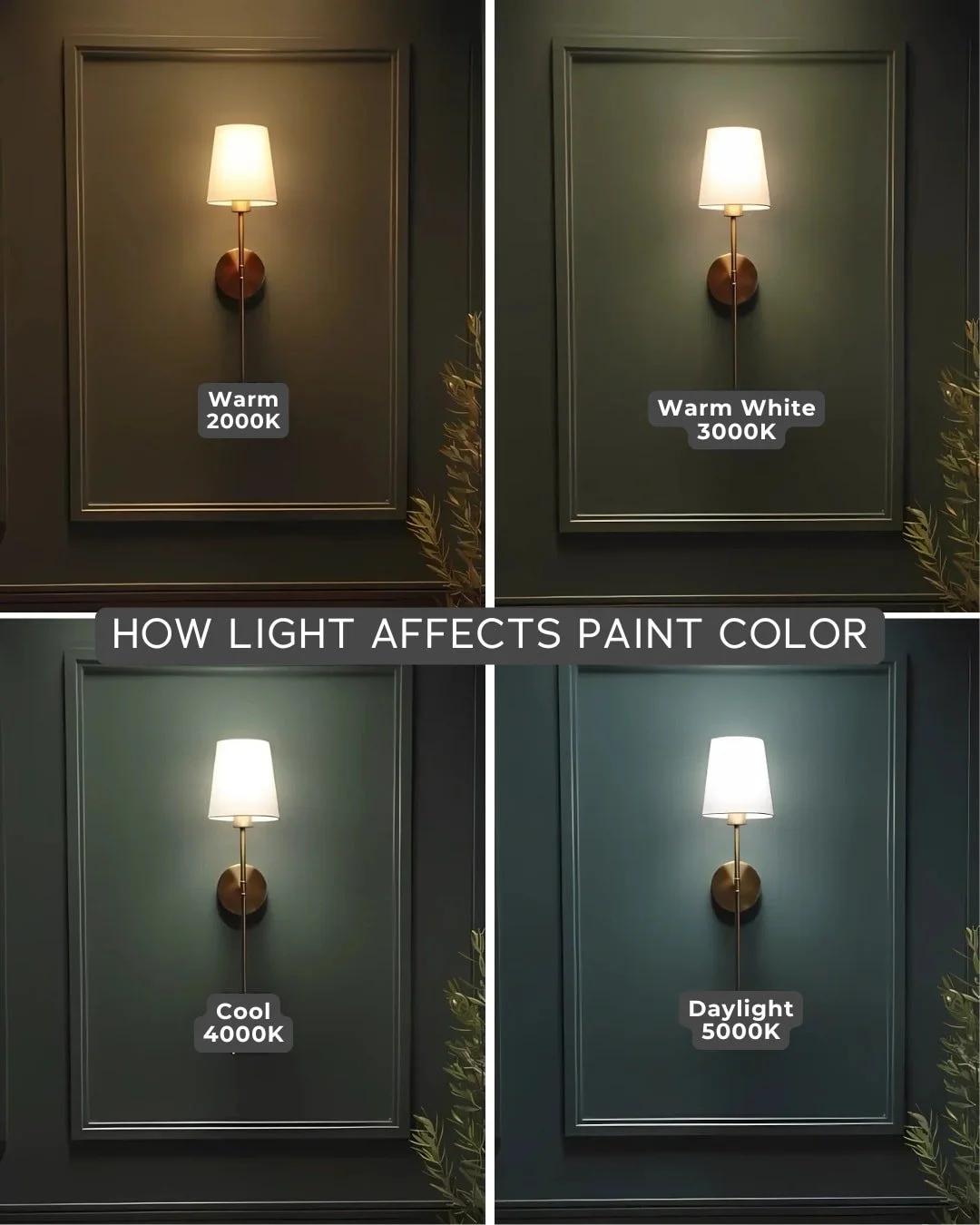
How Warm Light Affects Wall Colour:
Warm lighting has a beautiful way of elevating interiors. It enriches earthy neutrals like beige, taupe, stone, and greige, adds depth and sculptural warmth to textured finishes such as limewash or Venetian plaster, softens stark whites into a gentle, creamy glow, and mutes cool undertones so greys and blue-based colours feel more relaxed.
How Cool Light Affects Wall Colour:
Cool lighting, with its blue undertone, completely shifts how colours appear on your walls. Warm neutrals can suddenly look flat or grey, blue and green undertones become more pronounced, and textured surfaces lose their softness as natural shadow play disappears. Even warm whites turn stark and icy under cool light. While cool lighting can work in certain minimalist or ultra-modern spaces, it often clashes with organic, natural interiors, making it less ideal for most residential homes.
How to Choose the Right Light for Your Wall Colour
Here’s the designer-approved framework we use at Sojo Design:
1. Pick warm lighting for neutral interiors:
If your home features beiges, nudes, greiges, stone, or clay tones, warm lighting is essential.
2. Avoid cool lighting unless you’re going for ultra-minimalist or gallery-style interiors:
It suits crisp whites and monochromatic palettes, but it’s unforgiving.
3. Always test paint with the exact bulbs you’ll be using:
What looks perfect under one light can look completely different at night.
4. Use dimmers wherever possible:
Light should adjust with the mood, soft evenings, bright mornings and ambient afternoons.
Final Thoughts
Paint and lighting are inseparable. Even the most beautifully curated neutral palette won’t look its best under harsh, cool lighting. Warm, considered lighting not only makes your wall colour shine, it transforms the entire mood of your home.
If you’re planning a renovation, repaint, or new build, make lighting an early conversation.
Your walls (and your entire interior) will thank you for it.