
THE POWER OF CONTRAST IN DESIGN
When people think about contrast in interior design, they often picture black and white colour schemes. While colour is certainly one way to create contrast, it goes much deeper than that. Contrast is one of the most powerful tools designers use to create interest, balance, and visual impact within a space.
Without contrast, interiors can feel flat and one-dimensional. When used thoughtfully, it helps define a room, highlight key features, and create a sense of depth that makes a space feel layered and considered.
Contrast Creates Visual Interest
A beautifully designed space is rarely made up of identical colours, textures, and materials. Instead, it's the interplay between different elements that captures attention and keeps a room feeling dynamic.
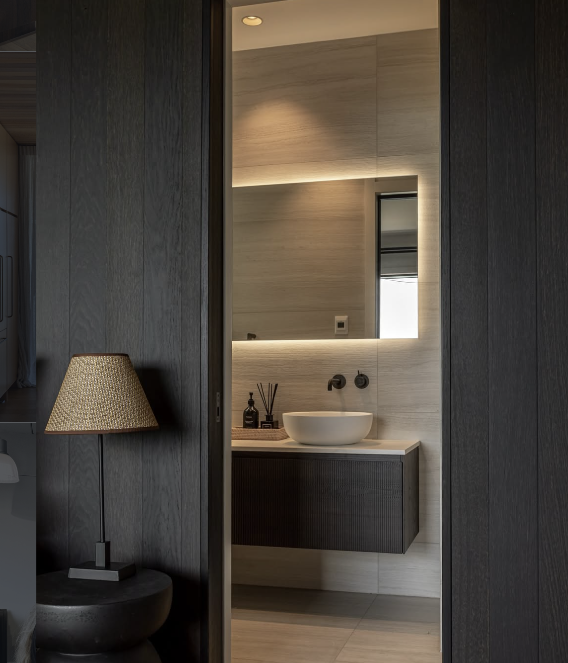
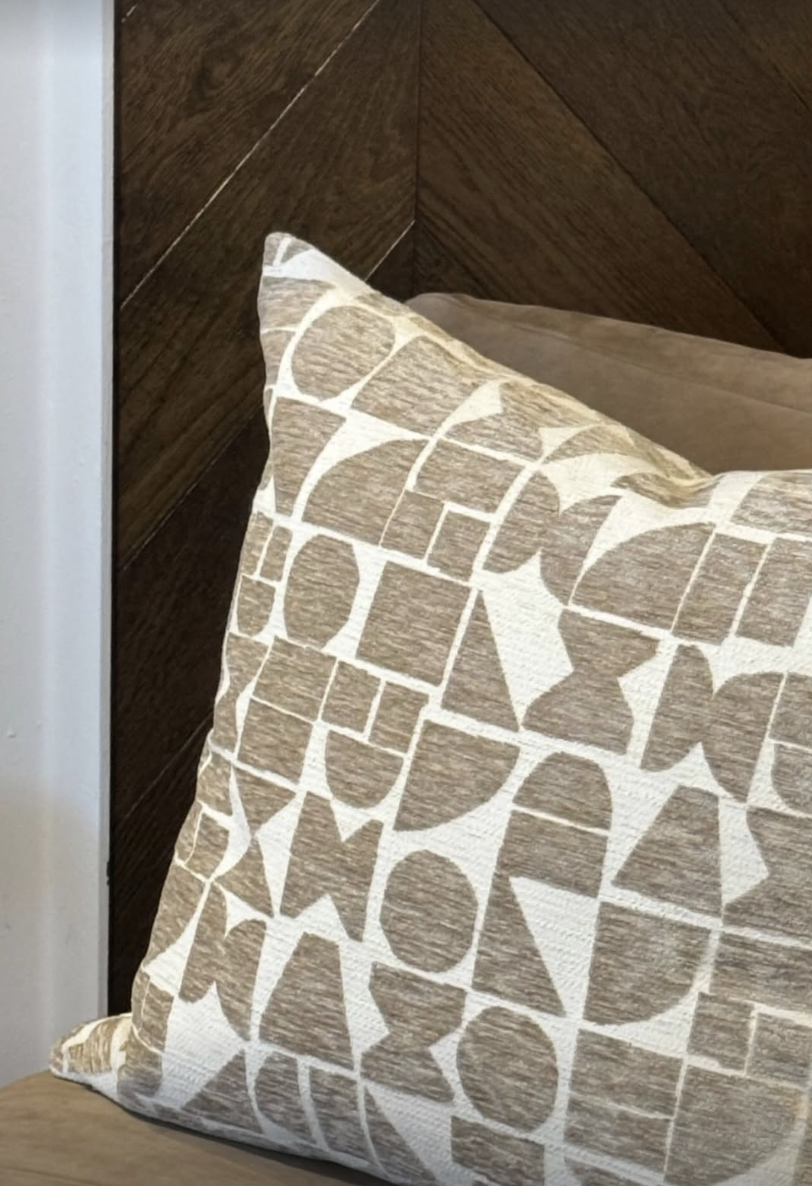
This might mean pairing a smooth stone coffee table with a textured boucle sofa, or introducing darker accents into an otherwise light and neutral palette. These differences create visual tension in the best possible way, allowing each element to stand out while contributing to the overall design.
It's Not Just About Colour
One of the biggest misconceptions about contrast is that it only relates to colour. In reality, contrast can be created through:
Texture: Linen against timber, wool against stone, matte finishes alongside polished surfaces.
Shape: Curved furniture balanced with clean architectural lines.
Scale: Oversized artwork paired with smaller decorative objects.
Materials: Natural elements such as oak, travertine, and marble combined with metal or glass accents.
Light and Shadow: Layered lighting that creates depth throughout the day and evening.
Some of the most sophisticated interiors use subtle contrast rather than dramatic statements. The result feels effortless, but every element has been carefully considered.
Why Contrast Matters in Neutral Interiors
At Sojo, we're often drawn to neutral palettes because they create a timeless and calming foundation. However, a neutral space still needs contrast to feel complete.
A room filled with the same tone can quickly feel washed out. By layering varying shades, textures, and materials, we create depth while maintaining a cohesive look.
For example, a soft ivory or beige sofa might be paired with a darker timber coffee table, black accents, textured cushions, and natural stone finishes. While the palette remains neutral, the contrast between the elements adds richness and character.
Creating Balance
The key to successful contrast is balance. Too little and a room can feel uninspiring, too much and it can feel chaotic.
We often think of contrast as a way of guiding the eye through a space. It helps establish focal points, define different areas, and create moments of interest without overwhelming the overall design.
The most inviting interiors are those that feel harmonious while still offering enough variation to keep them engaging.
The Sojo Approach
When designing or staging a home, contrast is something we consider from the very beginning. Whether we're selecting furniture, styling accessories, or layering materials, we're always looking at how different elements interact with one another.
It's often these subtle contrasts that make a space feel elevated, thoughtful, and memorable. They may not be the first thing you notice, but contrast is often the reason a room feels layered, balanced, and complete.